
Corporate Reporting
GrainGrowerS
Layout DESIGN
I regularly design editorial layouts for GrainGrowers, a national organisation representing Australian grain producers. My work spans a broad range of publications — from concise two-page fact sheets to in-depth policy reports of up to 70 pages. These documents are often content-rich, covering technical topics such as climate policy, sustainability reporting, and fuel security.
I’m responsible for translating dense information into accessible, on-brand layouts that maintain clarity, hierarchy, and visual flow. Working within established guidelines, I build structured templates, design supporting graphics, and collaborate with editors to ensure each report is both visually cohesive and easy to navigate, whether viewed digitally or in print.
I was responsible for the full layout design of this 15-page publication produced by GrainGrowers, which explores Australia’s opportunities in biofuel production. The report balances technical content with clear visual hierarchy, using consistent styles, spacious formatting, and branded imagery to ensure both readability and professionalism.
The publication includes charts, case studies, infographics, and a variety of text-heavy sections. I applied structured formatting using InDesign paragraph styles, collaborated with editors to fit late content, and created visual solutions for complex topics — such as Australia’s fuel import dependence and carbon reduction targets.


Reformatted and styled government-sourced data for accessibility and visual clarity.

Implemented image placements that balance narrative tone with whitespace

Maintained consistent brand typography and colour palette while adapting to diverse content types

Used modular design elements across policy pages for easy navigation in print and digital formats.


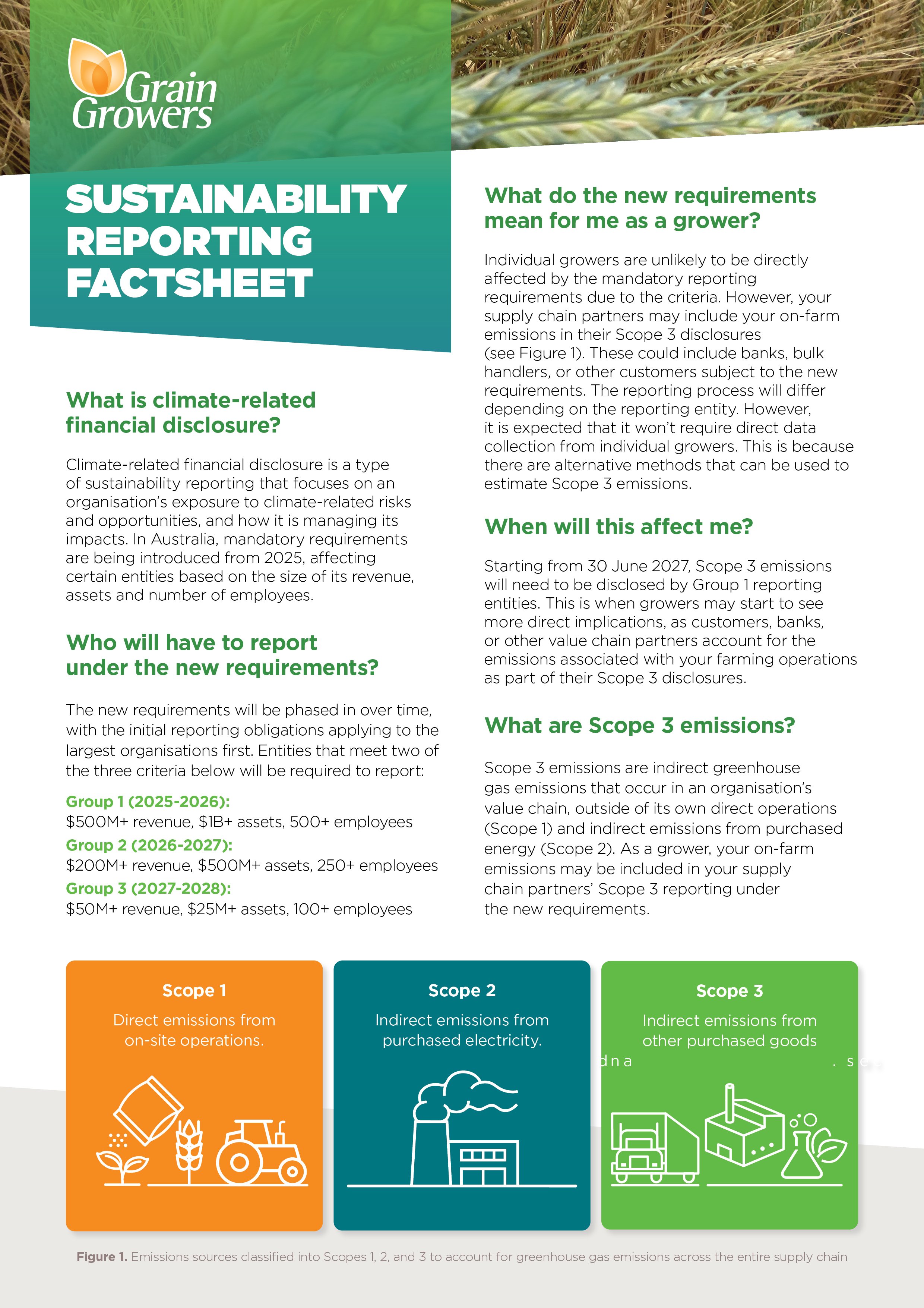
This factsheet was designed as a clear, accessible resource to explain upcoming climate-related reporting changes to grain growers across Australia. I was responsible for the visual layout, including the arrangement of dense legal and policy content into a user-friendly A4 format. My focus was on hierarchy, alignment, and tone — keeping it professional and policy-focused without being visually overwhelming.
I used a flexible grid and paragraph styles to maintain structure while creating space for key pull-quotes, breakout boxes, and diagrams. Subheadings and bolded content were strategically used to allow for easy skimming, and icons were introduced to support content engagement